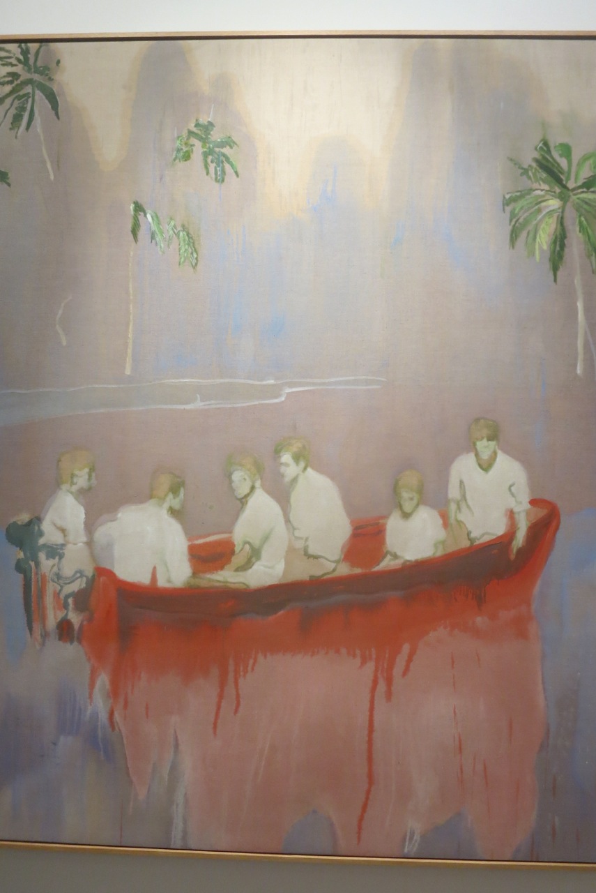
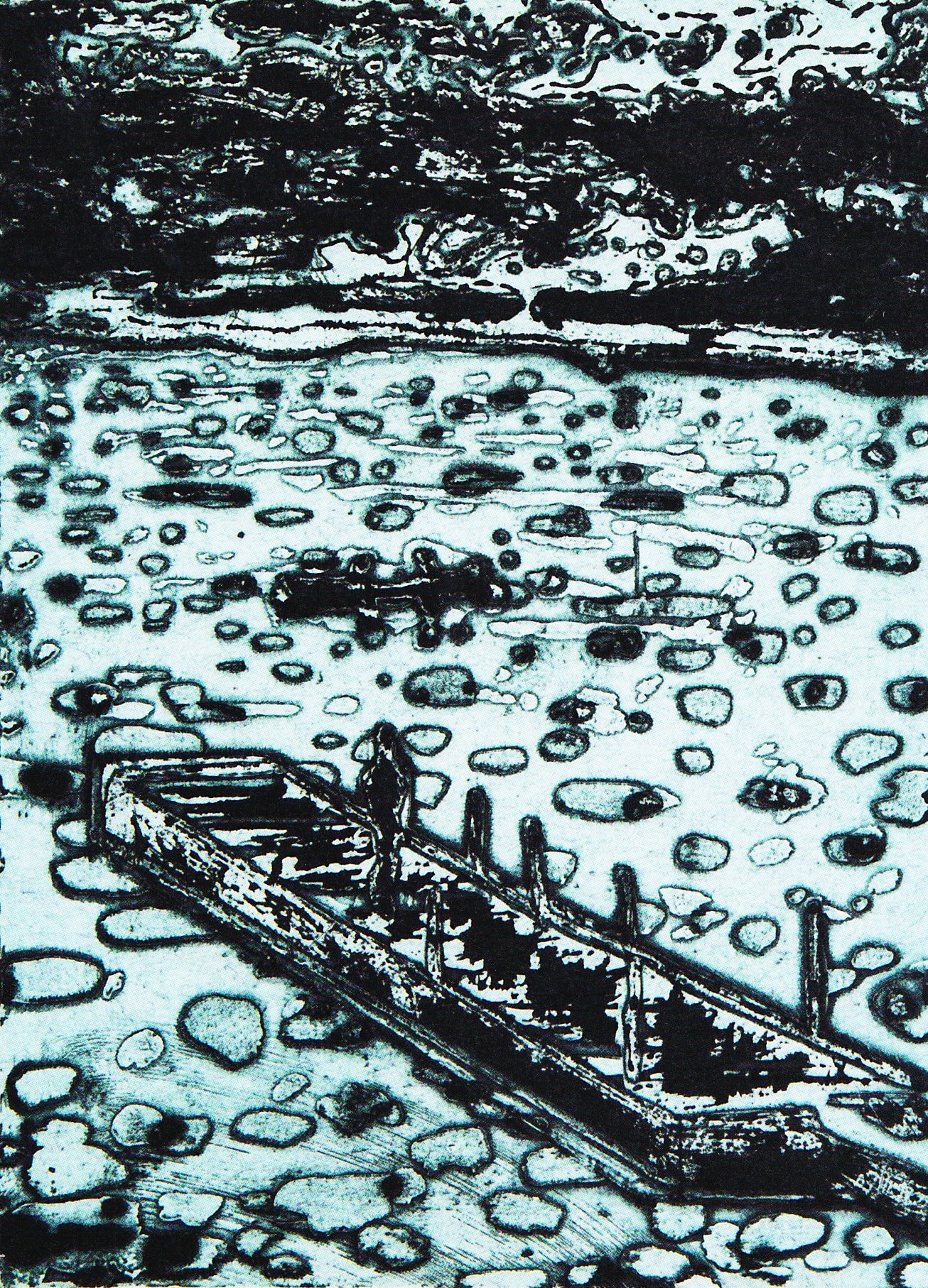
Rinus Van de Velde – work from ‘Donogoo Tonka’ – boat (2015-16, charcoal on canvas)

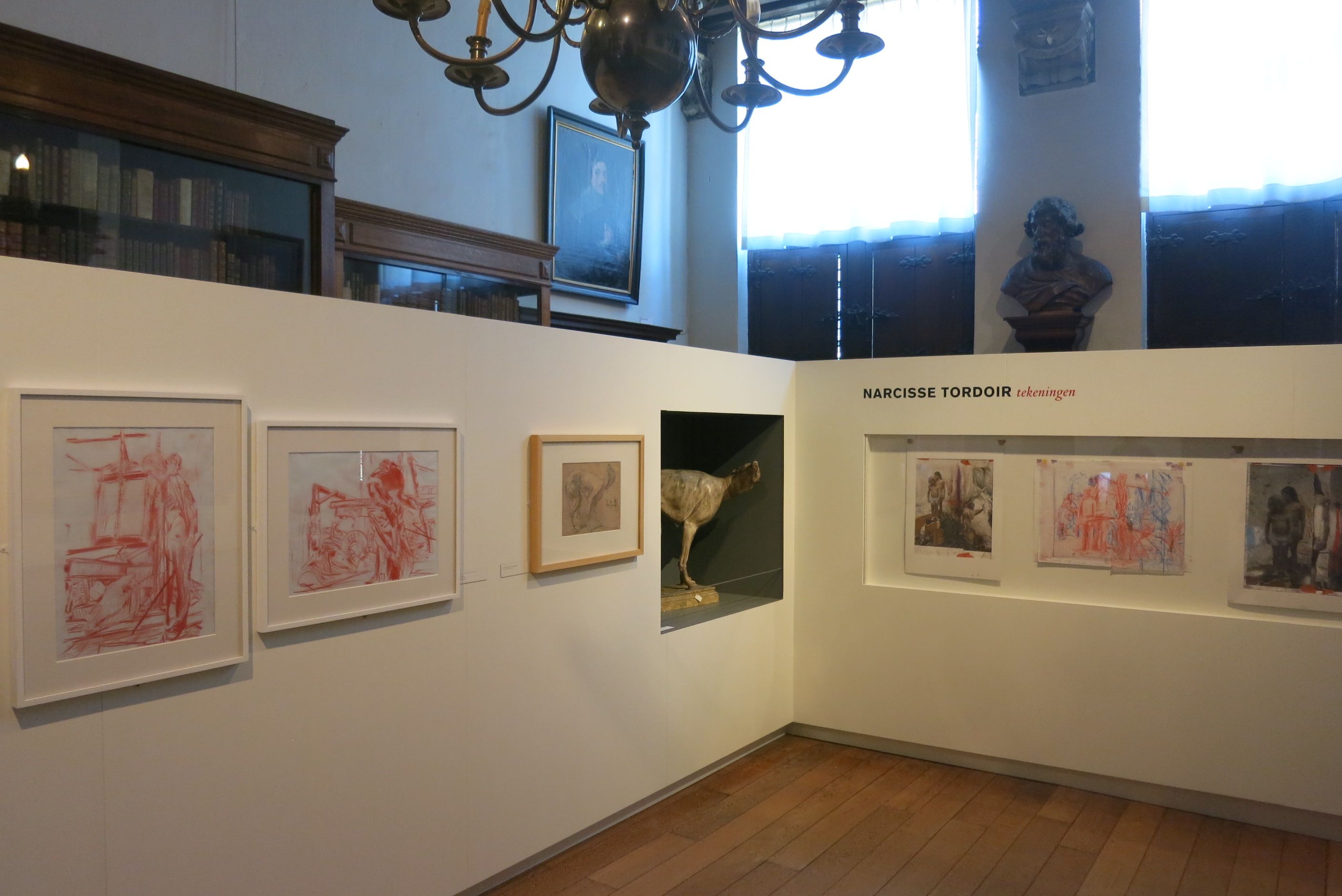
Rinus Van de Velde – exhibition view ‘Donogoo Tonka’ in SMAK
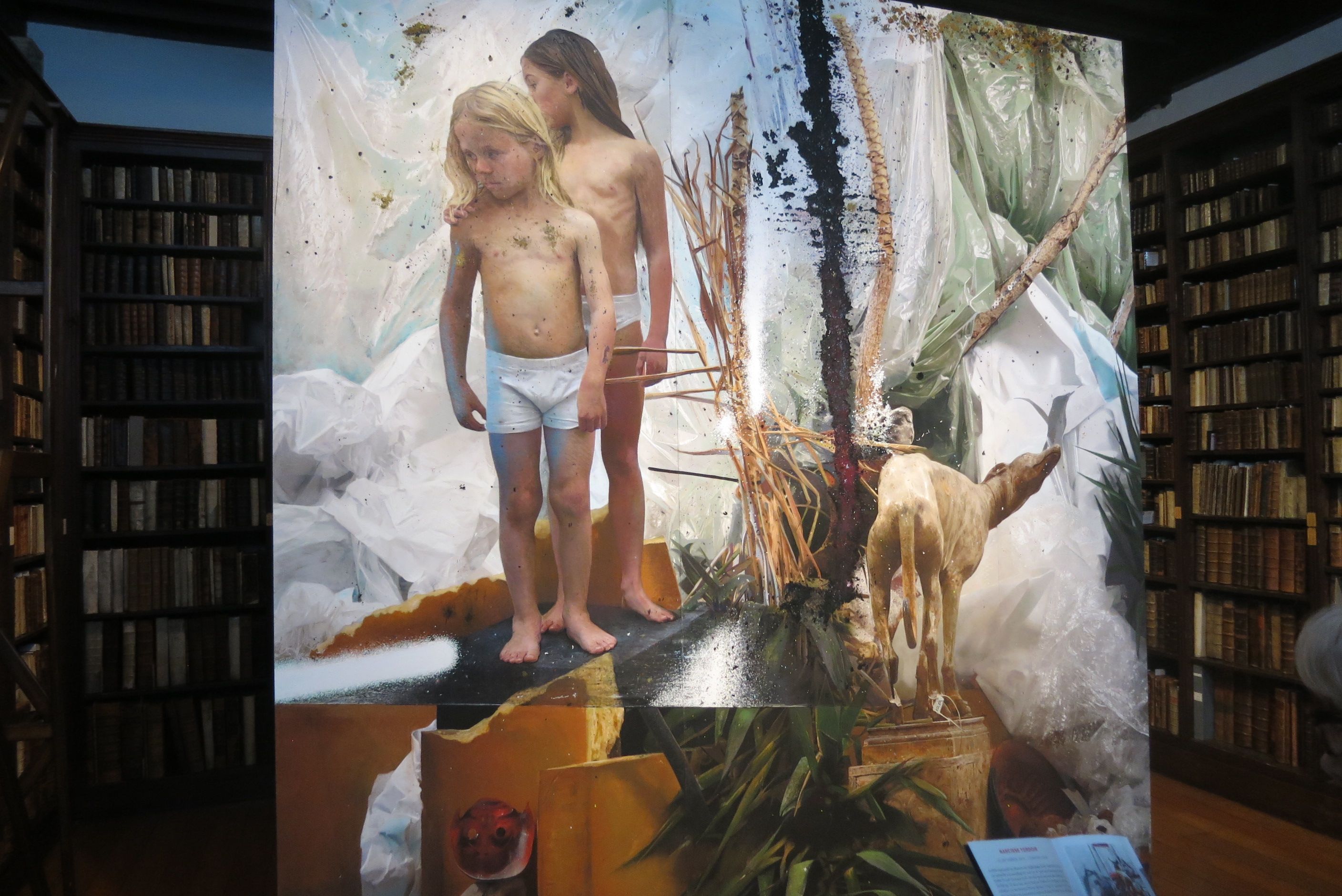
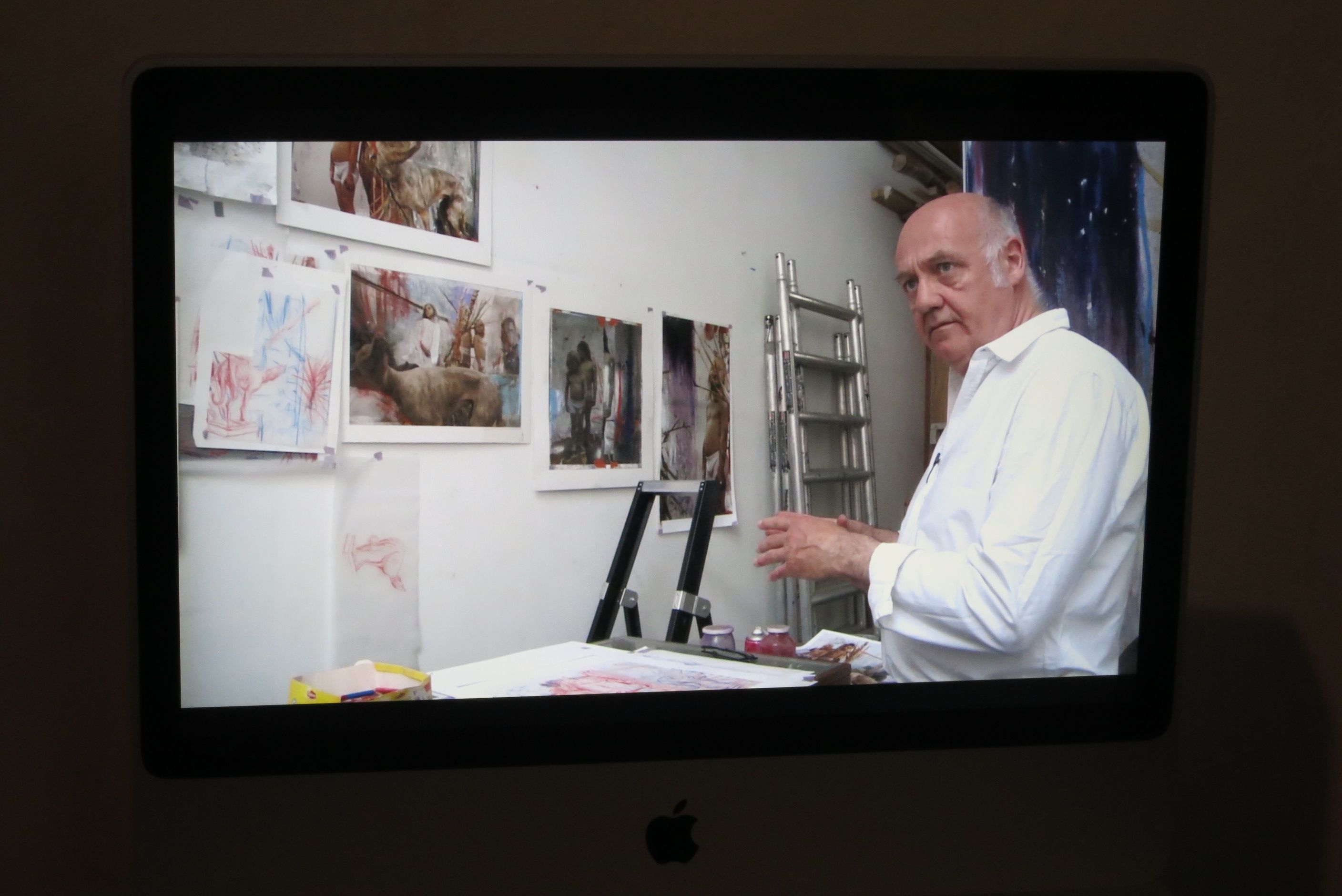
Rinus Van de Velde (Belgium, 1983) works big. The core of his work consists of very large charcoal drawings on canvas. The drawings are the end result of an exciting process that takes approximately one month: he looks for illustrations, makes real life stage sets, directs, acts, photographs and finally draws a selected photograph. To the drawings he then adds text.
He likes to have friends around in his studio and involves them in the preparation of his images, sometimes engages them to pose and to contribute to the accompanying texts.

Rinus Van de Velde – work from ‘Donogoo Tonka’- car (2015-16, charcoal on canvas)

Rinus Van de Velde – work from ‘Donogoo Tonka’ – the bar (2015-16, charcoal on canvas)
In his second exhibition at S.M.A.K. (Ghent, Belgium) Rinus Van de Velde visualises the novel “Donogoo Tonka ou les miracles de la science” (1920) by the French author Jules Romains. He has converted this satire on capitalism and the ideology of progress into a storyboard of nine scenes in which he plays the leading character. Using drawings, texts on the wall and stage set elements he has constructed a mesmerising installation.

Rinus Van de Velde – work from ‘Donogoo Tonka’ – papers (2015-16, charcoal on canvas)

Rinus Van de Velde – work from ‘Donogoo Tonka’ – psychiatrist (2015-16, charcoal on canvas)
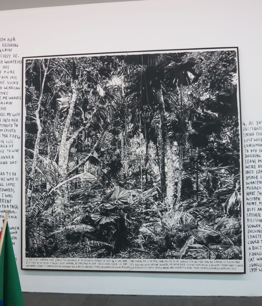
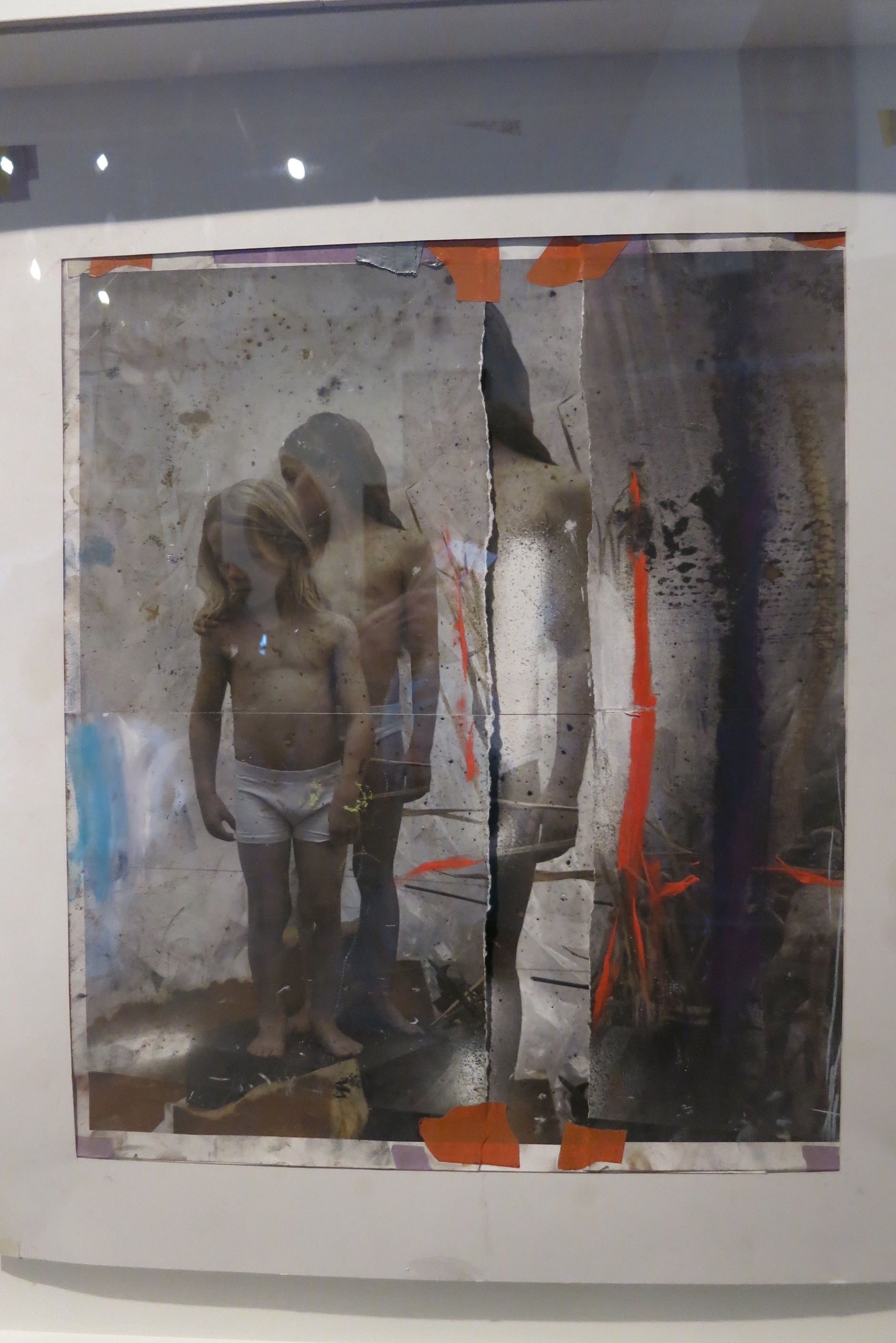
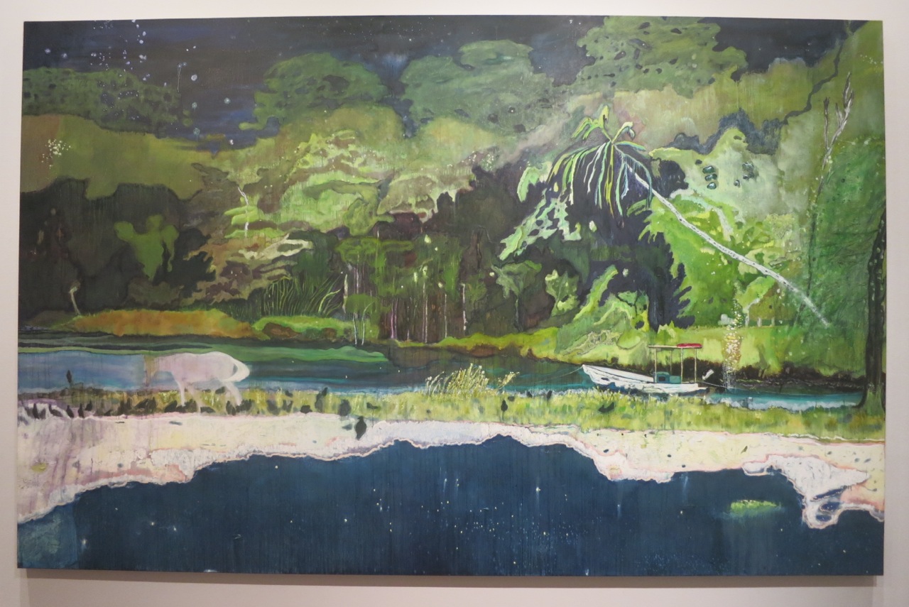
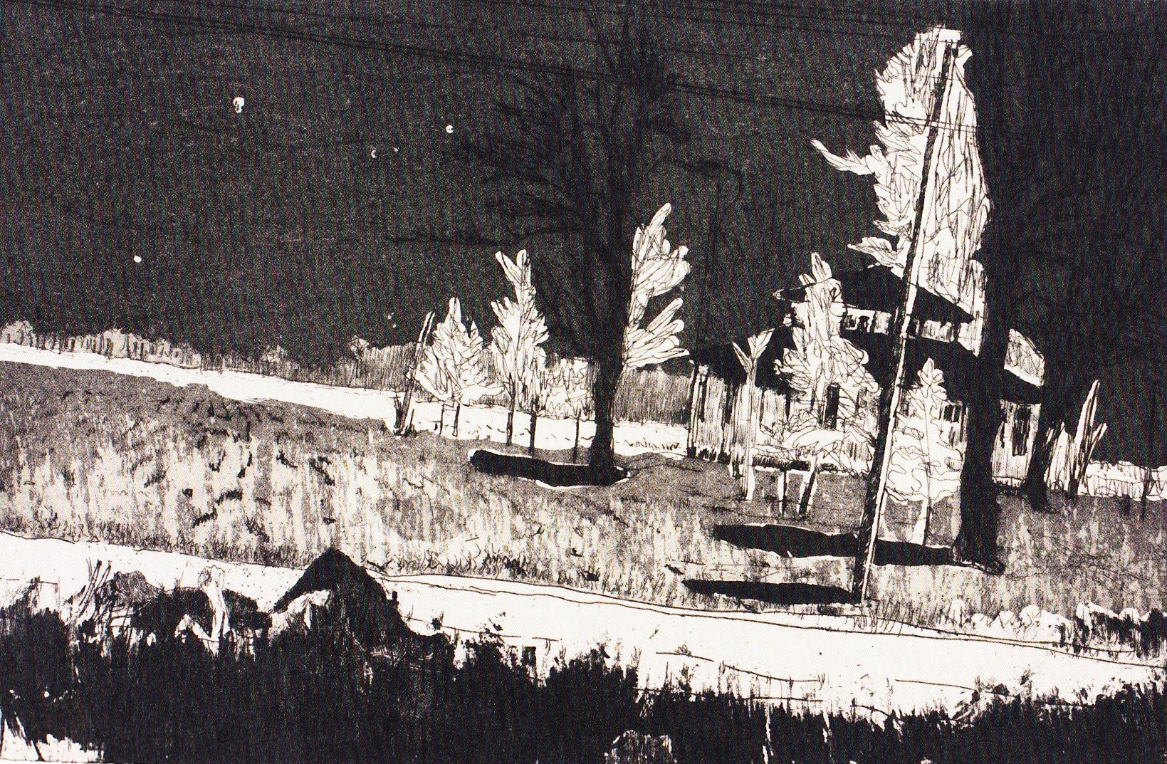
Rinus Van de Velde – work from ‘Donogoo Tonka’ – jungle (2015-16, charcoal on canvas)

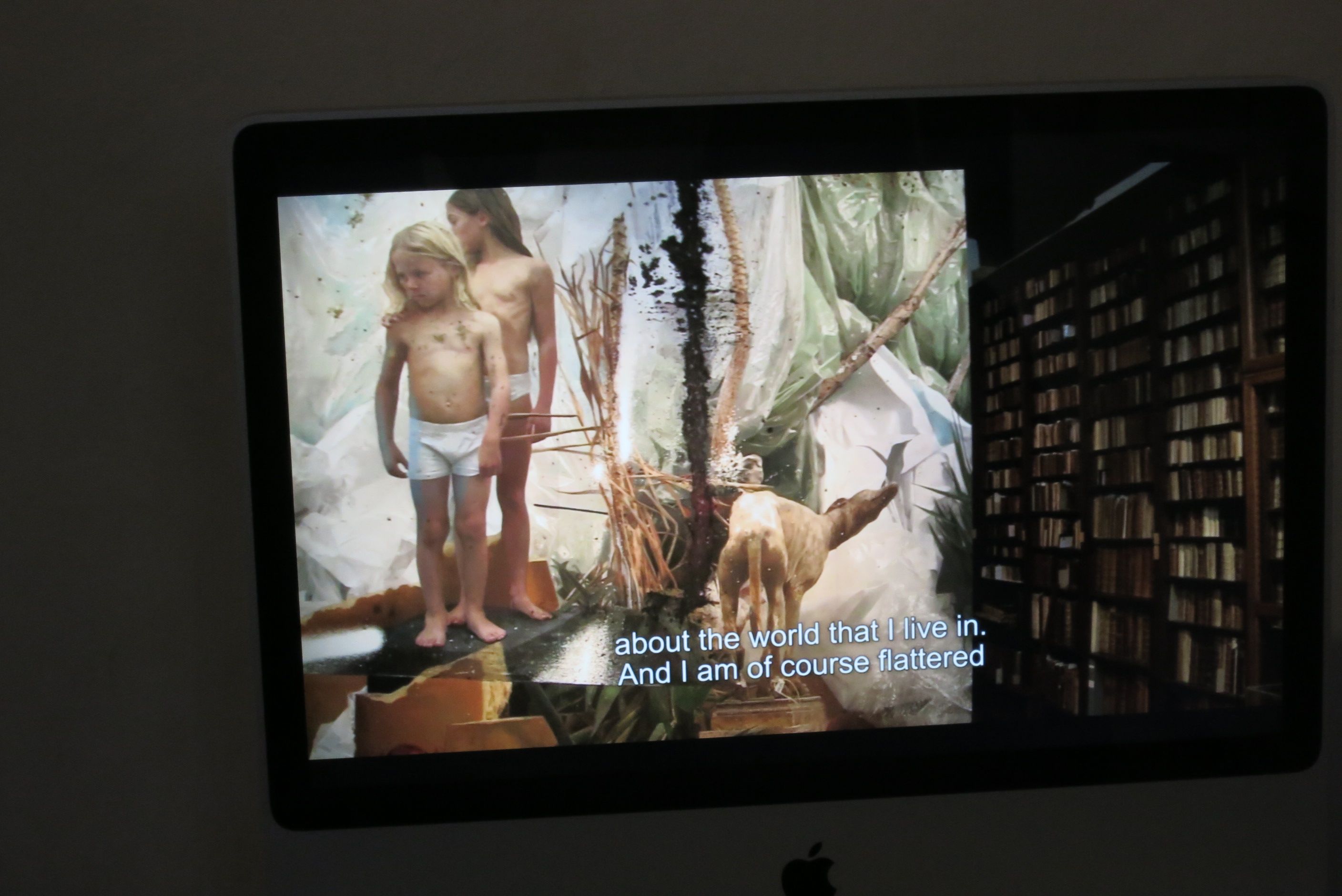
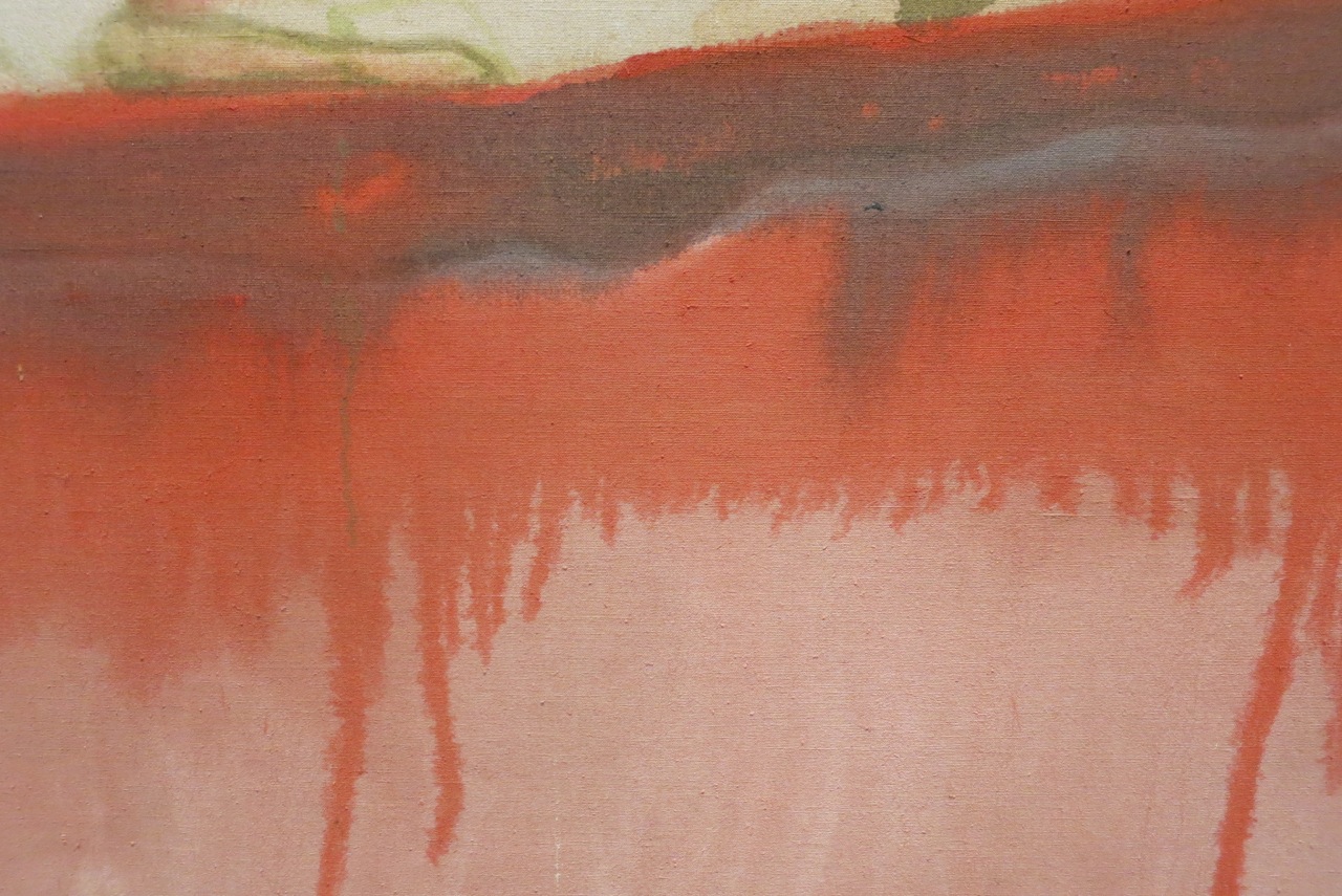
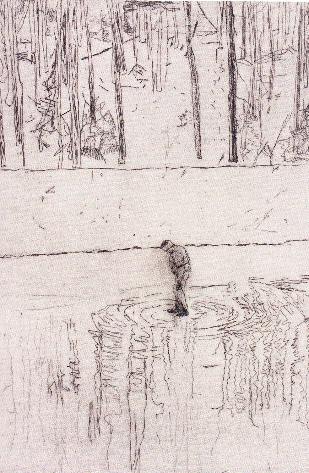
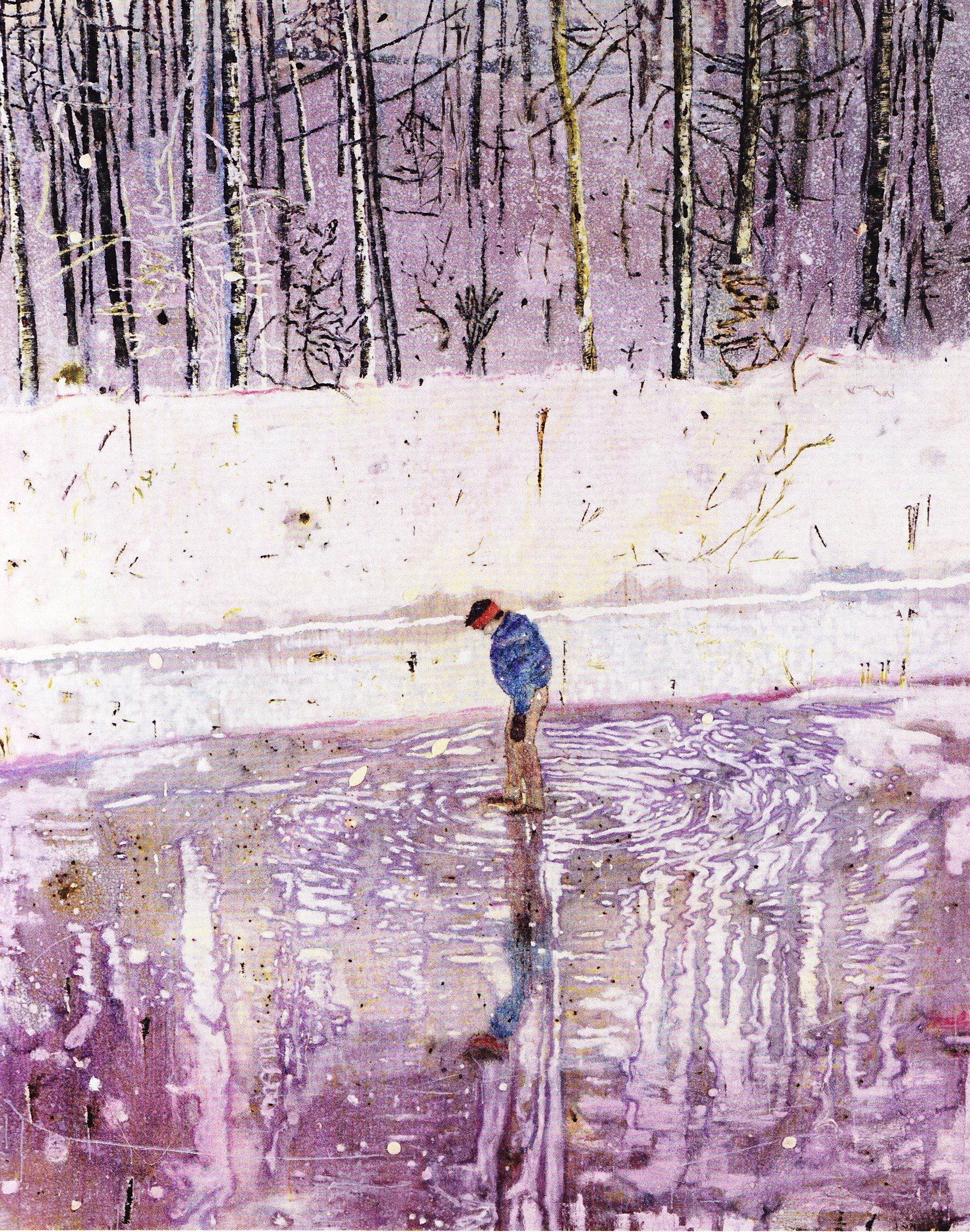
Rinus Van de Velde – Sweet and intoxicating reverie (boat), 2016
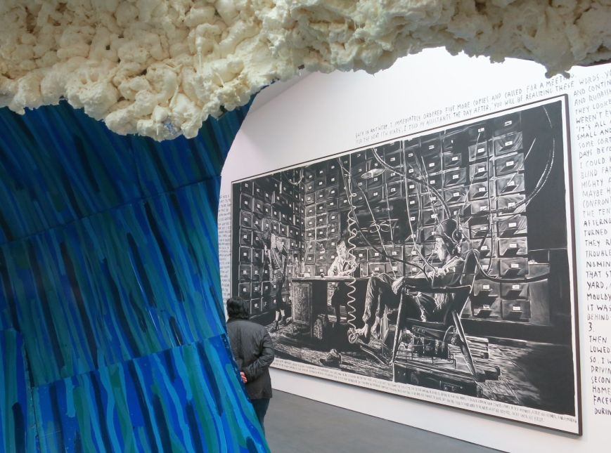
Rinus Van de Velde – exhibition view ‘Donogoo Tonka’ in SMAK with stage set wave in forefront
His friend Koen Sels contributes a lot to the accompanying texts and also interviewed Rinus while working in his studio. It’s a very interesting read if you want to know more about Rinus Van de Velde. Find it here.
Exhibition still on view in S.M.A.K. till 5 June 2016 – highly recommended and if you manage to visit don’t miss the work Rinus Van De Velde made in situ in the museum café.
All pictures are taken by me in the exhibition.